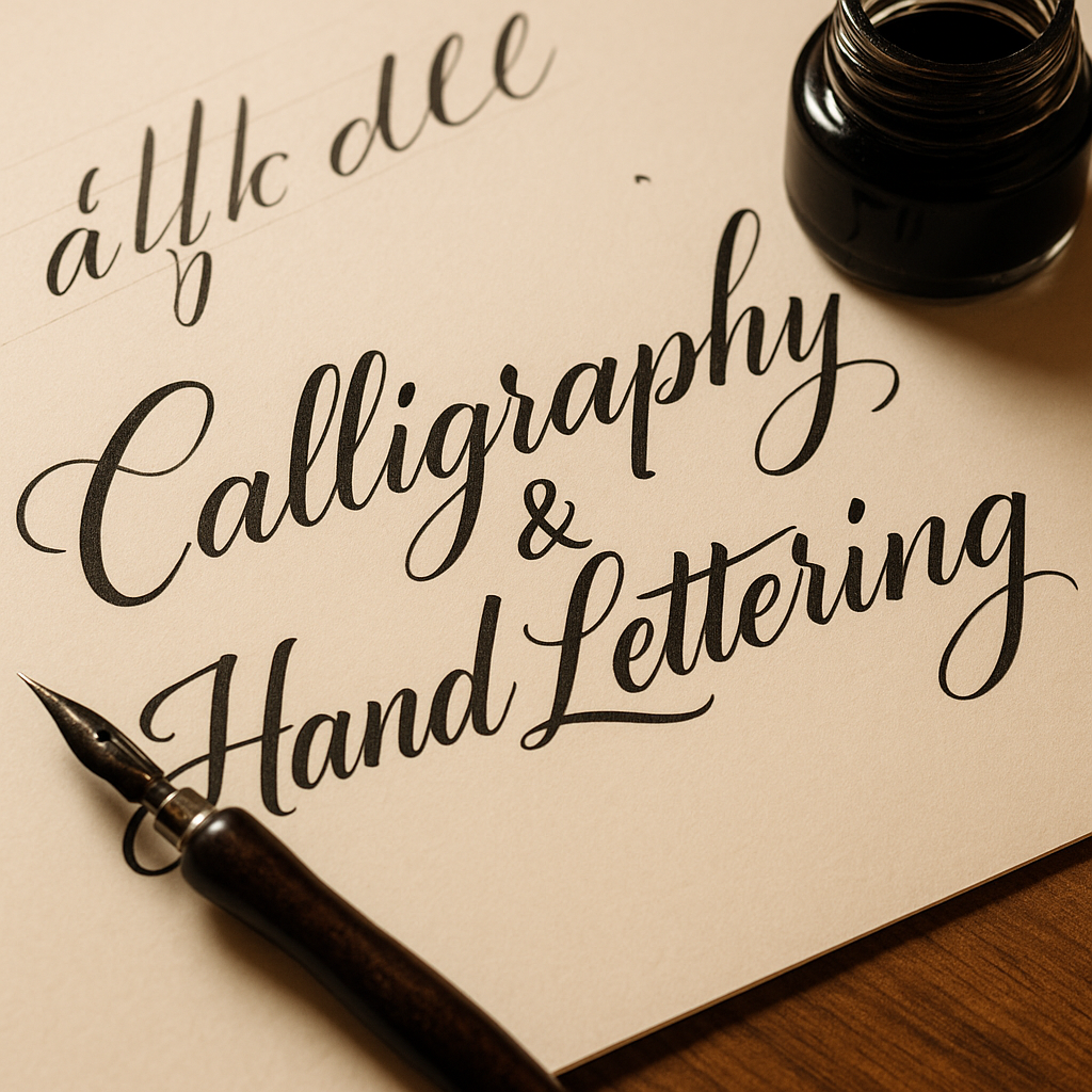
Title: Calligraphy & Hand Lettering – Drawing Letters with Personality
Calligraphy isn’t just writing – it’s the art of giving letters rhythm, weight, and soul. Whether you're aiming for classic copperplate scripts or playful modern lettering, this hobby combines fine motor skills with expressive design.
Let’s dive into how you can get started with calligraphy and hand lettering:
1. Know the difference.
Calligraphy is about writing – you use tools like nib pens or brushes to form letters in real time, with variation in pressure and stroke.
Hand lettering is about drawing letters – each shape is crafted like an illustration.
Both are deeply artistic and often overlap in style and technique.
2. Start with basic tools.
For beginners:
Calligraphy: a dip pen + nib + ink (or brush pens for ease)
Hand lettering: pencils, fineliners, and brush pens (Tombow, Fudenosuke, etc.)
Smooth paper that won’t bleed or feather
Digital tools like the Apple Pencil + Procreate are also great alternatives.
3. Learn the strokes, not just the alphabet.
Practice basic strokes: upstrokes (light), downstrokes (heavy), loops, ovals. Master these before you form letters – they’re the building blocks of every script.
4. Focus on spacing and balance.
Beautiful lettering is more about consistency than perfection. Watch for even spacing, similar angles, and good rhythm between letters.
5. Use guidelines.
Draw pencil guides for baseline, x-height, ascenders, and descenders. It’s not cheating – it’s essential.
6. Don’t rush.
Speed kills style. Take your time. Breath, write slowly, and enjoy the flow. Good calligraphy feels meditative.
7. Explore different styles.
Try gothic blackletter, italic, Roman capitals, modern script… or create your own. Mixing styles can add personality to your projects.
🎯 Pro Tip: Post your progress and practice sheets on net-twin.de
– our creative community loves beautiful lines, mindful craft, and expressive inkwork.
📌 #Calligraphy #HandLettering #ModernScript #CreativeWriting #InkArt #nettwin
Kind regards, Andy 🤩
-----------------------------------
Advertising that's really worth it for you!
Get it now: Get a €100 voucher from Temu (new customers only)!
Step 1 - Use my voucher link: https://temu.to/m/uwsjqkbzhhl
Step 2 - Enter the following code in the search field at Temu to secure your €100!
The Code: tar37925
Title: Calligraphy & Hand Lettering – Drawing Letters with Personality
Calligraphy isn’t just writing – it’s the art of giving letters rhythm, weight, and soul. Whether you're aiming for classic copperplate scripts or playful modern lettering, this hobby combines fine motor skills with expressive design.
Let’s dive into how you can get started with calligraphy and hand lettering:
1. Know the difference.
Calligraphy is about writing – you use tools like nib pens or brushes to form letters in real time, with variation in pressure and stroke.
Hand lettering is about drawing letters – each shape is crafted like an illustration.
Both are deeply artistic and often overlap in style and technique.
2. Start with basic tools.
For beginners:
Calligraphy: a dip pen + nib + ink (or brush pens for ease)
Hand lettering: pencils, fineliners, and brush pens (Tombow, Fudenosuke, etc.)
Smooth paper that won’t bleed or feather
Digital tools like the Apple Pencil + Procreate are also great alternatives.
3. Learn the strokes, not just the alphabet.
Practice basic strokes: upstrokes (light), downstrokes (heavy), loops, ovals. Master these before you form letters – they’re the building blocks of every script.
4. Focus on spacing and balance.
Beautiful lettering is more about consistency than perfection. Watch for even spacing, similar angles, and good rhythm between letters.
5. Use guidelines.
Draw pencil guides for baseline, x-height, ascenders, and descenders. It’s not cheating – it’s essential.
6. Don’t rush.
Speed kills style. Take your time. Breath, write slowly, and enjoy the flow. Good calligraphy feels meditative.
7. Explore different styles.
Try gothic blackletter, italic, Roman capitals, modern script… or create your own. Mixing styles can add personality to your projects.
🎯 Pro Tip: Post your progress and practice sheets on net-twin.de
– our creative community loves beautiful lines, mindful craft, and expressive inkwork.
📌 #Calligraphy #HandLettering #ModernScript #CreativeWriting #InkArt #nettwin
Kind regards, Andy 🤩
-----------------------------------
Advertising that's really worth it for you!
Get it now: Get a €100 voucher from Temu (new customers only)!
Step 1 - Use my voucher link: https://temu.to/m/uwsjqkbzhhl
Step 2 - Enter the following code in the search field at Temu to secure your €100!
The Code: tar37925